

Preview
Creation Date
2020
Description
National Park Service Signage
Digital Media
11” X 49.33”
2020
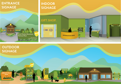
The National Park outdoor signage uses bright colors so that it can be seen from far away and stand out among the greenery within national parks. This encourages hikers to stay on designated trails. The indoor signage allows guests to explore what different buildings have to offer. Each signage uses the designated National Park symbology to direct guests.
My design work focuses on creating a more contemporary and vibrant brand identity for the National Park Service so that more funding can measured and appropriated to the agency. These works include a new logo, symbology, signage, font, and membership cards which all use some of the original iconic shapes of the past National Park branding in order to create some recognition when confronted with these new branding elements. Design works such as, a mobile app and brochure also utilize new technologies to create a more seamless informative experience for visitors. Notebooks, shopping bags, and water bottle designs were also created to be put in National Park gift shops to increase the revenue received from visitors. These uniform brand elements use fluid and organic mountainous shapes along with bright shades of orange and yellow to reflect the joy of visitors when discovering these unique American Landmarks.